Trade-ready architectural hardware, lighting, bathware and interior details.
Resources

Lighting Temperature: How to Choose Warm, Neutral, and Cool

Colour temperature — measured in Kelvin — is the difference between a kitchen that feels alert and one that feels warm, and between a bedroom that helps you sleep and one that wakes you up. It’s also the spec on a lightbulb that most people ignore. This guide explains what the numbers mean and how to choose.

Anony Highwire pendant in an open industrial loft

What is colour temperature?

Colour temperature describes the hue of light a bulb produces, measured in degrees Kelvin (K). Lower numbers — around 2700K — are warm and yellow, like candlelight. Higher numbers — 5000K and above — are cool and bluish, like overcast daylight. The middle ground, around 3000K to 4000K, sits between the two.

The counterintuitive part: higher Kelvin means cooler-looking light. The number describes the temperature a theoretical black-body radiator would have to be heated to in order to glow that colour, which is why a “warmer” 2700K bulb actually has a lower number than a “cooler” 5000K one.

What do common Kelvin values look like?

2700K is the warm yellow-orange of an incandescent bulb or candle — cozy, intimate, slightly atmospheric. 3000K is similar but cleaner, often described as “warm white.” 4000K is neutral, close to mid-day daylight. 5000K reads as bright, crisp white. 6500K is the cool blueish white of a clear-sky afternoon — alerting, but cold in a residential setting.

Manufacturers’ definitions of these temperatures vary slightly, so two bulbs both labelled 3000K may not match. This is one of the more common sources of mismatched lighting in a finished space.

Which colour temperature should I use in each room?

Match the temperature to how the room is used. Bedrooms and living rooms — places to relax — benefit from warmer light around 2700K to 3000K. Studies have linked warmer light in the evening to better sleep quality. Kitchens, bathrooms, and home offices — where you need to see clearly — work better at 3000K to 4000K. For art collections, walk-in closets, or any room where colour accuracy matters, true white in the 4000K to 5000K range gives the most honest read.

The lighting designer Christian Lo of Anony, whose fixtures we carry, frames it as a question of how the room is lived in: “If you actually work at your dining table, we’ll want to cool that colour a bit.” Function determines temperature more reliably than aesthetics.

Function determines temperature more reliably than aesthetics. Match the Kelvin to how the room is used, not to how the fixture looks.

What temperature works in commercial spaces?

The defaults break down in commercial work. An art gallery needs colour-accurate light close to 4000K so paintings render the way they would outside the space. A jewellery shop benefits from cooler light to make stones sparkle. A butcher wants warmer red tones that flatter meat. A restaurant changes through the day — a café might run cooler in the morning to feel fresh and warmer in the evening to feel inviting.

For commercial fixtures with adjustable colour temperature, the same fixture can do both. Otherwise, choose for the dominant use of the space.

Why does the same Kelvin number look different from different brands?

LED quality varies, and “3000K” is a target rather than a guarantee. Cheap LEDs often skew green or pink at the same nominal temperature, and the colour can shift over the bulb’s life. The best lighting brands quality-test bulbs before shipping them with their fixtures — Anony, for example, sources from ten to twenty manufacturers and only ships the ones that match their colour reference.

For any fixture you care about, buy the bulbs from the same supplier as the fixture if possible, or from a dedicated lighting supplier rather than a general retailer. The price difference between a good LED and a poor one is small. The visual difference is not.

Browse fixtures and recommended bulbs in the lighting collection.

Resources

Ceiling Light Fixtures: How to Choose by Room

A pendant hung at the wrong height makes a kitchen feel awkward, a dining room feel cluttered, and an ambient lamp feel like a task light. Most of the rules that prevent this come down to a handful of measurements. This guide covers the ones we get asked about most.

Tense pendant ceiling lights

What size pendant do I need over a kitchen island?

Two formulas, both useful. Measure the width of the island and subtract 12 inches — that gives you the maximum total width of all your fixtures combined. So a 36-inch-wide island can carry up to 24 inches of pendant width, which means two 12-inch pendants. The second method: measure the length of the island and pick fixtures with a diameter no larger than 25% of that length. A 60-inch island would take pendants up to 15 inches across.

The two methods rarely give the same answer, which is fine — they’re guidelines, not rules. Use them to stay in the right range, then trust your eye for the final call.

How many pendants should I hang over an island?

Two pendants for islands under six feet long. Three for islands above six feet. Larger pendants count for more visual weight, so above a six-foot island you’d hang either three small pendants (under 10 inches) or two larger ones (15 to 18 inches). A single statement fixture also works — sized at no more than two-thirds the island’s length.

How far apart should pendants be spaced?

Eighteen inches minimum between any two pendants, regardless of size. For pendants smaller than 18 inches in diameter, that 18-inch gap is enough. For larger pendants — over 18 inches — increase the gap to match the diameter: two 24-inch pendants need 24 inches between them.

At the ends of the island, leave a gap at least half the diameter of the pendant. For pendants under 10 inches, leave 12 inches at each end so the run doesn’t feel crowded.

What size pendant fits a dining table?

Half to two-thirds the width of the table. A 60-inch round table takes a 30-to-40-inch fixture. The pendant should always be centred over the table, not over the centre of the room — if the table moves, the pendant moves with it. Reinstalling a pendant is a small electrical job and worth doing.

What size pendant works for a living room?

For ambient lighting in a living or sitting room, add the room’s width and length in feet, then convert that number to inches — that’s a reasonable starting diameter. A 10-by-15 foot room sums to 25 feet, which suggests a pendant around 25 inches across. The number is a guide, not a target; a slightly smaller fixture in a room with low ceilings, or a larger one as a deliberate statement, both work.

How high should I hang a ceiling light?

Leave at least one foot of clearance between the bottom of the pendant and anyone standing or sitting underneath. As a starting point, a pendant should hang 12 to 20 inches below an 8-foot ceiling — the longer drop suits a coffee table or dining table, the shorter drop suits anywhere people will be standing. For every additional foot of ceiling height, add 3 inches to the drop. A 10-foot ceiling brings the recommended range to 18 to 26 inches below the ceiling.

Can I break these rules?

Yes — but commit. The rules above produce reliably good results for the same reason all design rules do: they describe what most rooms need most of the time. Breaking them works when the break is decisive. A pendant that’s slightly too large reads as a mistake; a pendant that’s clearly oversized reads as intentional. The same applies to asymmetry, off-centre placement, and unconventional pairings. Half-measures look like accidents.

For more on placement specifically, see our guide to pendant lights. Browse the full range in the ceiling lighting collection.

Collections

Explore Further

Resources

Pendant Lights: How to Choose, Where to Use, and What Height to Install

Pendant lights do disproportionate work in a designed space. They bring light from the ceiling down to where people actually use it — over a kitchen island, above a reading chair, alongside a sofa, in a stairwell — and they’re one of the few fixtures that can function as both task lighting and ambient drama, depending on bulb choice and dimmer settings. This guide covers the practical questions that come up when specifying pendants — what they are, where they belong, what height to install them at, how many you need, and how to handle slanted or vaulted ceilings.

Ferm Living Collect socket pendants in a row

“Design is defined by light and shade. Appropriate lighting is enormously important.”

— Albert Hadley

What is a pendant light, and how does it differ from a chandelier?

The terms get used loosely — “pendant” often means *modern and minimal*, “chandelier” often means *fussy or ornate* — but both have specific definitions worth getting right. A pendant light is a single light fixture suspended from the ceiling by one cord, chain, or rod. A chandelier has multiple branches and multiple light sources radiating from a central body. The distinction matters because the two fixtures behave differently in a room: a chandelier’s distributed bulbs spread softer ambient light across a wider area, while a pendant concentrates more focused light over a defined zone, making it the better choice for task lighting over a kitchen island, dining table, or reading chair.

Some fixtures blur the line — a multi-cord pendant cluster reads visually as a chandelier but is mechanically a group of pendants. The functional question is whether the fixture lights one zone (pendant work) or a broader area (chandelier work). The aesthetic question is whether you want the visual mass of a chandelier or the lighter touch of a single suspended object.

Why use a pendant instead of a chandelier?

Three reasons specifiers reach for pendants over chandeliers. First, focus — pendants concentrate light where it’s needed, which is why they dominate kitchen island lighting, dining tables, and reading nooks. A chandelier in those positions illuminates the whole room but can leave the working surface itself underlit. Second, scale flexibility — a single pendant suits a small room or a tight zone where a chandelier would feel oversized. Third, visual restraint — pendants read as architectural details rather than decorative statements, which suits projects working in a more minimal language.

Pendants also work in places people don’t typically expect them. Try a single pendant in place of a wall sconce — flanking a bed, beside a sofa, or asymmetrically over an occasional chair. Two matched pendants either side of a bed read as a more current alternative to bedside lamps; one pendant offset to the side of a sofa reads as deliberate eclecticism rather than an oversight. The technique works because pendants are inherently sculptural; they earn the visual weight that a sconce or table lamp would need additional decorative treatment to achieve.

Where should I put pendant lights in my home?

Pendants belong wherever overhead light needs to come closer to the working surface. The four positions where they earn their keep:

Over kitchen islands and counters. The default and best-known pendant position — bringing task lighting down to within reasonable distance of the cooking surface, often grouped in clusters of two or three for an island, or a single oversized pendant for a smaller counter.

Over dining tables. A single large pendant or a group of three smaller ones, hung at a height that lights the table without obstructing across-table conversation. Always specify on a dimmer — bright pendants for homework, dim pendants for dinner parties, all from the same fixture.

In foyers, hallways, and stairwells. Tall vertical spaces (entryways with double-height ceilings, stairwells, vaulted hallways) reward pendants because the cord length itself becomes part of the design — a single dramatic pendant at depth, or a cluster of pendants at varied heights, fills vertical space that a flush-mount or chandelier can’t.

As wall-light substitutes. Beside a bed, alongside a sofa, over a side table, beside a reading chair — pendants used as sconce or lamp replacements add architectural weight to spaces that would otherwise rely on traditional plug-in lighting. Particularly useful when the side-table real estate is precious and a free-standing lamp gets in the way.

What height should pendant lights be installed at?

Two distinct rules apply, depending on whether the pendant hangs over a walking area or over a surface.

Over walking areas: hang pendants a minimum of seven feet (2.1 metres) from the floor — roughly 12 inches down from a standard 8-foot ceiling. For taller ceilings, add approximately 3 inches of cord per additional foot of ceiling height: a 10-foot ceiling gets a 30-inch cord, an 11-foot ceiling gets a 33-inch cord. The principle is that nobody should ever bump into the fixture, and the visual proportion stays right as the ceiling rises.

Over surfaces (kitchen islands, dining tables, bars, desks): hang the bottom of the fixture 30–36 inches above the surface. Specify 30 inches for ceilings under 8 feet, 36 inches for ceilings of 9 feet or more. The pendant should illuminate the surface clearly without sitting in anyone’s sightline across the table or counter.

Sightline tip: aim for a fixture height roughly 6 inches above the head of the shortest person who’ll regularly use the space. A pendant that puts its bulb directly in a child’s or shorter adult’s eyeline is functionally a problem — they’ll be looking up into a glare every time they sit down. Lower the pendant or specify a fixture with a diffused light source (frosted glass, fabric shade, or a downward-facing reflector).

How many pendant lights should I use in one space?

Depends on the zone being lit and the fixture’s individual scale. Two practical formulas:

Over an island or bar: two to three pendants for an island under 8 feet, three to five for an island 8–12 feet long. Space them evenly along the island’s length, with the outermost pendants set in roughly 12–18 inches from the island ends. Pendants too close together cluster visually; pendants too far apart leave dark zones at the counter ends.

Over a dining table: one pendant for round or square tables under 5 feet across, one to three pendants for rectangular tables, scaled to the table’s length. A single oversized pendant centred above the table often reads stronger than a cluster, particularly in minimal spaces.

In a foyer or stairwell: one dramatic pendant at the appropriate scale for the space, or a cluster of varied-length pendants suspended at staggered heights. Three or five (odd numbers) usually read better in a vertical cluster than two or four.

For a deeper room-by-room breakdown including ceiling-mount alternatives, sconce coordination, and lighting layering principles, see our guide to designing your space with ceiling light fixtures.

How do I choose a pendant light for my space?

Scale is the primary consideration — too large or too small for the room will feel off in ways that nothing else compensates for. The general rule of thumb: add the room’s length and width in feet, and use that sum (in inches) as the rough diameter of a single pendant, or distribute that diameter across multiple smaller fixtures. A 12 × 14-foot room suggests roughly 26 inches of total pendant width, which could be one 26-inch fixture, three 9-inch pendants, or a cluster covering similar visual mass.

The corollary: if you’re breaking the rules, commit. Pendants work in extremes — slightly off-centre or marginally oversized reads as a mistake; defiantly asymmetrical or unmistakably oversized reads as intentional. The middle ground rarely succeeds. Designers who break scale rules usually do it dramatically — a single 36-inch pendant in a small bathroom, a cluster of tiny pendants in an enormous foyer — and the result lands precisely because it’s deliberate.


How do I install pendants on slanted or vaulted ceilings?

Three categories, with progressively more involvement required.

Corded pendants — the simplest case. A pendant hung from a flexible cord adapts to any ceiling angle on its own, because gravity pulls the fixture straight down regardless of how the mount is angled. Most pendant lights at Casson fall in this category. Cord length is also easily adjustable — most can be trimmed by an electrician to the exact length the ceiling height demands. For a slanted-ceiling kitchen island or dining room, a corded pendant is often the only adjustment needed.

Rodded pendants — slanted-ceiling adapter required. Pendants suspended on a stiff metal rod (rather than a flexible cord) are designed to hang straight down from a flat ceiling. On a slanted ceiling they hang at the same angle as the slope unless adjusted. Most quality rodded pendants offer an optional slanted-ceiling mount that pivots the rod back to vertical — specify this at order. For non-standard ceiling angles, a custom slanted mount can usually be sourced through your contractor.

Multi-branched fixtures — expert installation. Chandeliers, multi-pendant arrays, and fixtures like Anony’s Highwire or Schneid’s Phase chandelier require careful balance and proportion across multiple suspension points. On a slanted ceiling, this means the mount needs to compensate for the angle while preserving the fixture’s intended geometry — work that requires both an experienced electrician and, ideally, the manufacturer’s input on the specific installation. For made-to-order multi-branched fixtures, send the full ceiling measurements at the time of order so the mount can be designed for the space.


Browse the full ceiling lighting collection for pendants, chandeliers, and flush-mount options. For the next article in the series — covering room-by-room lighting strategy and how pendants coordinate with sconces, recessed lights, and table lamps — see our guide to ceiling light fixtures. For more on the Canadian designers behind some of our strongest pendant work (Anony, Object/Interface, Schneid), see Canadian Design at Casson.

Resources

Wall Hooks: How to Choose for Entryways, Mudrooms, and Bathrooms

Wall hooks are one of the small specifications that organize a whole room — entryway, mudroom, bathroom, kid’s bedroom, kitchen pegboard wall, the back of a passage door. The right hook in the right place earns its keep daily; the wrong one becomes the thing nobody uses. This guide covers five categories of wall hook worth knowing about — multi-hook racks, sculptural single hooks, minimal architectural hooks, hanging-rod systems, and hand-finished textured pieces — and how to choose between them for the way each room actually gets used.

How do I choose the right wall hook?

Three questions are worth asking before specifying. First — how many things does this hook need to hold, and how often? An entryway in a four-person household needs different capacity than a single hook by a guest bathroom door. Second — how visible is the hook when nothing is hanging from it? An empty hook is a small piece of wall sculpture; a sculptural hook earns its visual weight, while a minimal hook recedes when not in use. Third — what’s the substrate, and is the hook strong enough for what it’ll carry? Wet coats are heavy; tote bags loaded with groceries can run to 30 pounds; a single sand-cast brass piece will hold all of that, while a delicate decorative hook is best reserved for hats and lightweight items. For more on installing hooks across substrates — drywall, plaster, brick, tile — see our guide to installing on walls.

How many wall hooks do I need?

For an entryway, plan two hooks per regular household member at minimum — one for an everyday coat, one for a bag, scarf, or backup outerwear. A four-person household needs at least eight hooks at the front entry, and probably more if children are still in the layered-everything phase of life. For a mudroom serving the same household, double that figure to account for seasonal gear (rain jackets, ski gear, dog leashes, sports bags). For a guest bathroom or powder room, two hooks suffice — one for a hand towel, one for a robe or jacket.

Spacing matters as much as count: hooks need approximately 6–8 inches of horizontal clearance between centers for a coat to hang without overlapping its neighbour. Pack hooks tighter than that and the lower hooks become unusable when the upper ones are loaded. Children’s hooks can be closer together — kids’ coats are smaller, and kids tend to use the same hook every day regardless.


Five categories of wall hook, and where each works

Hooks below are organized by *function and visual weight* rather than by manufacturer. Each category solves a slightly different specification problem — picking the right category usually matters more than picking the right specific product within it.

Multi-Hook Racks: The Catch-All

For high-capacity, single-installation entryways where one piece needs to do all the work. The Afteroom Coat Hanger by Menu is the reference object here: a Bauhaus-inflected rack with six flat circular heads, mountable horizontally or vertically, with all mounting screws hidden for a clean architectural read. Made of powder-coated zinc alloy in black, white, or brass (special order), with a smaller version available for tight spaces. Use a single Afteroom in a small foyer or kid’s room where multiple hooks need to live in a coordinated piece; use the larger version horizontally as the primary entryway storage moment.

View the Afteroom Coat Hanger


Afteroom Coat Hanger by Menu

Sculptural Singles: The Jewel

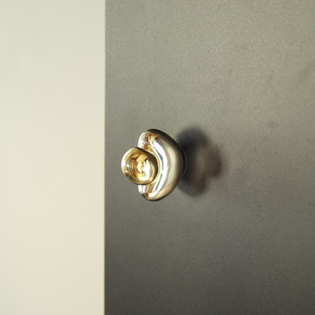
For entryways or rooms where the hook itself is part of the design — a small piece of wall jewellery that reads as decorative when nothing’s hanging from it. The Chanterelle Hook by Ferm Living, designed by jewellery designer Helena Rohner, is the strongest example: organic lines, available in nickel and brass, sculpted to look like an object rather than a fitting. Pair with the smaller Mushroom Hook from the same line for a constellation effect, or use a single Chanterelle as a discreet accent. Both hooks also function as cabinet or drawer pulls — useful when a kitchen or bath wants the same design language carried across hardware types.

View the Chanterelle Hook


Ferm Living Chanterelle Hook in nickel finish

Architectural Minimal: Charlie by CBH

For projects where the hook needs to coordinate with a broader architectural hardware program. The Charlie collection by Toronto-based CBH includes eight hook variants — the slender Pencil Hook for narrow spaces, the chunky Angular Hook for heavy coats, the semi-circular Round Hook for playful entryways, the discreet Wedge Hook for under-shelf installations, plus Nail, Bumper, Single, and standard variants. All are made in Canada, available in CBH’s full finish range, and designed to coordinate with Charlie cabinet hardware, door levers, and grab bars across a project. Specify when the hook is one piece of a larger architectural hardware brief rather than a standalone moment.

Browse the Charlie Collection


Flat lay of Charlie hooks by CBH

Hanging Rods: The Rack Approach

For situations where a single rod with movable S-hooks suits the use better than fixed hooks — kitchens with open shelving, mudrooms where bags and coats rotate seasonally, the back of a passage door where projection depth matters. The Pyra Hanging Rack by Toronto designer Shayne Fox is hand-crafted in unlacquered brass, made to order, mountable directly to a shelf or to the wall via the Pyra wall plate — a touchable, eclectic piece that ages into a living finish over time. The Ferm Kitchen Rod is the more affordable equivalent: six closed-loop S-hooks, available in brass or black, rated for up to 11 pounds. Both work better than fixed hooks in narrow hallways or behind doors, where projection matters more than visual presence.

View the Pyra Hanging Rack


Pyra hanging rack by Shayne Fox

Hand-Finished Textured: Mi & Gei

For projects where the hook is unambiguously functional art — sand-cast brass and nickel pieces with hand-honed surfaces that read as objects worth touching. The Libre Forme series from Mi & Gei runs from the small No. 4 (a tactile nugget good for lightweight items) through the art-deco-inflected No. 5, the open-circle No. 7, the architectural No. 6, and the heavy-duty arched No. 9. All are unlacquered — the brass and nickel will patina with use as living finishes. Specify a single piece as an accent in an under-utilized space, or three in a row as a guest entryway moment where the hooks are part of what greets visitors.

Browse Mi & Gei


Mi & Gei Libre Forme No. 6 hooks in brass


Where should wall hooks be installed?

Standard adult coat-hook height is 60–66 inches above the floor — high enough that a hung coat clears the ground, low enough that average-height adults can reach the hook without stretching. Children’s hooks should drop to 36–48 inches depending on the age of the child; a hook the kid can’t actually reach gets used by adults instead, defeating its purpose.

For mudrooms with multiple users, install at two heights — adult hooks at 60–66 inches, children’s hooks at 36–48 inches, with the rows offset horizontally so coats don’t collide vertically. For guest bathrooms, a single hook at 60–66 inches suffices for a robe, with a second hook 12 inches lower for hand towels if needed.

Substrate matters: most decorative hooks are rated for drywall installation with appropriate anchors, but heavy-use entryway hooks should be mounted into wall studs whenever possible. Plaster walls (older homes) and brick or masonry walls (commercial fit-outs) require specific anchor systems — covered in detail in our guide to installing on walls. For sand-cast or solid-metal hooks like Mi & Gei or Pyra, stud mounting is non-optional.

What’s the strongest wall hook for heavy items?

Solid-metal hooks installed into wall studs. The Charlie Angular Hook (chunky double hook, made of solid brass), the Mi & Gei Libre Forme No. 9 (heavy-duty arched piece), and the Pyra Hanging Rack (made-to-order brass) all hold substantial weight when properly mounted — heavy winter coats, loaded tote bags, dog leashes with leashed dog still attached. Avoid decorative or hollow hooks for heavy loads, and avoid drywall-anchored installations for anything that gets tugged daily — the anchor will eventually loosen, even when the hook itself is rated for the weight.


Browse the full hooks and racks collection, or get in touch about specifying for a project. For a related conversation on living finishes that age beautifully — relevant to Mi & Gei and Pyra specifically — see Hardware Finishes Part Two. For everyday-use brass care, see Hardware Finishes Part One.

Resources

QTOO: Award-Winning Danish Design from d line

Collection Highlight

Qtoo by d line is a Danish bathware collection — taps, showers, and accessories — built in marine-grade stainless steel. It’s the line we most often pair with the mudd. concrete sinks we carry, and one of the more durable bathroom systems available at any price.

Collection of Qtoo taps, faucets, and bathware

About the collection

Qtoo is a collaboration between d line — the Danish hardware studio whose work has set the standard for institutional and residential door fittings for decades — and the design firm Hans Thyge & Co. The pieces combine refined curves with carefully arranged geometric lines, and the system is engineered as a kit of parts: every component is designed to mount horizontally in line with the others, with internal hardware that handles spacing and levelling automatically.

The line is built in marine-grade stainless steel, leakage-tested at 15 bar, and carries a 10-year warranty. Every tap is lead-free, allergy-friendly, and certified GDV and NSF/ANSI 61 — the standards that govern heavy metal content in drinking water. Available in three PVD finishes, with sensor and non-sensor variants for both wall-mounted and counter-mounted installations.


Qtoo Tap

Operated by a single lever — soft for on/off, smooth for temperature and flow. Available in 190mm and 250mm wall-mounted lengths, in counter-mounted versions, and with sensor activation for commercial work. Every variant shares the same proportions, so mixing applications across a single project still reads as one system.

View the Tap

Qtoo tap by d line

Qtoo Shower

Spouts, showerheads, and control units designed to be specified together as a complete shower wall, or assembled piece by piece for custom layouts. The thermostatic version makes micro-adjustments to incoming water pressure, holding shower temperature steady regardless of what’s happening elsewhere in the building — particularly useful for two-way installations where flow needs to stay even across both heads.

View the Shower Set

Qtoo shower system by d line

Specifying Qtoo

The system suits both residential and commercial work — private bathrooms, hotels, government buildings, cultural institutions. Pieces can be ordered as a complete set or assembled as individual components, which is how most of our clients spec them. For multi-tap installations, ordering the full kit at once ensures consistent finish across the run; PVD finishes vary slightly between production batches.

For installations involving concrete or stone basins, the wall-mounted Qtoo taps are the more common choice — they keep the basin face uncluttered and let the material be the dominant visual element. Counter-mounted versions are typically specified with the smaller Qtoo tap on a vanity install.

Browse the full Qtoo collection, or get in touch about specifying for a project.

Resources

Kitchen Finishes: How to Coordinate Hardware, Taps, and Fixtures

Kitchen finishes — the surface treatments on faucets, hardware, lighting, and electrical fittings — are what hold a kitchen together visually. Get the relationships between them right and the room reads as composed; get them wrong and the design feels unfinished, no matter how good the cabinetry is.

Minimal kitchen design by Studio AC
Minimal wood kitchen island
Kitchen by Studio AC · Photography Jeremie Worshafsky

Should every finish in a kitchen match?

No — and they probably shouldn’t. Matching every finish to the same exact tone tends to flatten a room. The goal is coherence, not uniformity: finishes that share an undertone and a level of polish, even when they aren’t the same metal. Brushed nickel hardware sits comfortably alongside a stainless faucet because both are cool, both are matte. Unlacquered brass with polished chrome will fight unless one is clearly the supporting element.

How do I pick a base finish for a kitchen?

Start with the largest fixtures — usually the faucet and the appliances — and let everything else respond to them. Stainless and brushed nickel read cool. Unlacquered brass, antique bronze, and copper read warm. Matte black is neutral but has more visual weight than people expect, and benefits from being repeated in two or three places rather than used once as an accent.

Once the base tone is set, hardware, lighting, and electrical fittings can layer in. They don’t have to match the base, but they should belong to the same family — a warm kitchen tolerates a brushed brass switch plate; a cool one calls for polished nickel.

Matching doesn’t mean identical. Finishes need to share an undertone — warm with warm, cool with cool — not a manufacturer.

Can I mix metals?

Yes, and most considered kitchens do. The rule that prevents mixing from going wrong is consistency of undertone. Two warm metals — say, brass and copper — sit well together because they read as related. Two cool metals do the same. Mixing across temperature is harder but possible when one finish is clearly dominant and the other is a single accent — a brass faucet against polished nickel cabinet pulls works; the same finishes split fifty-fifty across a kitchen tends not to.

Why does the same finish look different in different rooms?

Light. The same brushed nickel pull will read warmer in a kitchen with south-facing windows than in one lit by overhead LEDs at 4000K. North-facing rooms cool everything down. Adjacent surfaces also matter — a brass pull on a creamy oak cabinet looks completely different against a dark-stained walnut, even when the brass itself is identical.

This is why matching finishes from different suppliers usually works in practice, even when they don’t match perfectly to the eye. Spaced apart, with different lighting and different backgrounds, small variations disappear.

Classic kitchen design overlooking a garden, by Oda and King
Kitchen by Oda & King — plaster lime wash, polished stainless faucet, blackened bronze sconces, polished nickel switch panel by Forbes & Lomax.

How do I see how a finish will read before committing?

Order finish samples and view them in the actual space, under the actual lighting, against the materials they’ll sit alongside. Photographs and screen colours are unreliable — almost every finish renders differently in person. Bring samples home, put them on the cabinet they’ll be installed on, and look at them at different times of day. We sell finish samples for this reason; they’re the easiest way to avoid an expensive mismatch.

Browse the full hardware collection to see the range of finishes available.

Resources

Lighting Certification: A Specifier’s Guide to UL, ETL, CSA, and DLC

Every lighting fixture sold in North America has to clear a certification process that confirms it’s safe to install. The acronyms — UL, CSA, ETL, Energy Star, DLC — are easy to mistake for marketing language. They aren’t. This guide explains what each one means and which ones you need.


Figura Pendants — geometric pendant lights in lilac
Figura Pendants — Stream, Arc, and Cone

Why does lighting certification matter?

Two reasons. First, electrical inspectors require certified fixtures for new construction and major renovations — an uncertified light is a failed inspection. Second, certification confirms the fixture has been independently tested for fire risk, electrical safety, and (for some marks) energy efficiency. The certifications differ slightly between the United States and Canada, which is why a fixture sold in one country isn’t automatically approved in the other.

What do the major certifications mean?

The following are the marks you’ll see on lighting products in North America. Most fixtures carry one of the safety marks (UL, CSA, or ETL); some additionally carry an efficiency mark (Energy Star or DLC).

UL Underwriters Laboratories
United States. The most widely recognized safety mark. Confirms the fixture meets standards for electrical safety and fire risk.

CSA Canadian Standards Association
Canada. Required for fixtures sold in Canada. Standards are similar to UL but not identical, which is why some products carry both marks.

ETL Intertek
North America. An alternative safety mark recognized alongside UL and CSA. ETL-listed fixtures meet the same underlying standards.

Energy Star U.S. EPA & DOE
Energy efficiency, not safety. Indicates the fixture meets specific consumption thresholds. Carried alongside one of the safety marks above.

DLC DesignLights Consortium
Energy efficiency for commercial and industrial fixtures. DLC listing qualifies products for utility rebates in many jurisdictions.

How do I know which certification I need?

For residential installations, check what your local electrical code requires — usually one of UL, CSA, or ETL. For commercial projects, the code requirements are stricter and an electrician or building inspector should confirm the specific marks needed before specifying fixtures. Energy efficiency certifications (Energy Star, DLC) are usually optional for residential work but often required for commercial buildings seeking LEED or rebate qualification.

Every Casson lighting product page lists the certifications that apply. For orders of five or more units, additional certifications can sometimes be added — this varies by manufacturer and adds lead time, so let us know early if your project requires it.

Beyond certification: what else should I think about?

Certification confirms a fixture is safe and (sometimes) efficient. It says nothing about whether the fixture will work well in your space. That comes down to a few more practical decisions.

How do I plan a lighting layout?

Lighting designers think in three layers: ambient, task, and accent. Ambient light fills the room — usually overhead fixtures or wall-washing sconces. Task light handles specific activities — under-cabinet lights for a kitchen counter, a desk lamp for an office. Accent light highlights specific objects or features — a picture light, a track spot on a sculpture. Most rooms benefit from at least two of these, on separate switches or dimmers.

What bulb temperature should I use?

Warmer temperatures (2700K–3000K) suit bedrooms and living rooms; neutral to cool (3000K–4000K) suits kitchens, bathrooms, and offices. For more on this, see our guide to lighting temperature.

Why are dimmers worth installing?

A single fixture on a dimmer effectively becomes three different fixtures — bright for cooking or working, mid-range for eating or reading, low for evening atmosphere. Dimmers also extend bulb life and reduce energy use when full brightness isn’t needed. Worth installing on any fixture used at varying times of day.

Browse the full lighting collection for fixtures, dimmers, and bulbs.

Resources

The BENDE Collection: Bathware from CSSN, Hand-Finished in Toronto

Collection Highlight

BENDE is the inaugural collection from CSSN, Casson’s in-house design studio — a seven-piece line of bathware accessories designed and hand-finished in Toronto. Each piece coaxes wide, fluid curves from a single sheet of metal, juxtaposing the hard structure of the material with the softness of the form. The collection is sold exclusively through Casson, and was developed as a working expression of the studio’s guiding maxim: multum in parvo, much in little.

BENDE bathware editorial photograph

About the collection

BENDE comprises seven pieces — a shelf, towel bar, toilet roll holder, single and double soap holders, and two hooks — designed to function independently or together as a coordinated bathware system. Circular forms recur throughout: in the curve of each piece individually, in the proportions that tie them as a family, and in the exposed mounting hardware, which is itself sculpted as part of the design rather than hidden beneath it.

Each component is shaped from a single sheet of metal. The studio chose the technique deliberately — sheet metal is one of the most basic and widely available materials in fabrication, and the design problem was figuring out how to coax sculptural curves from it without losing structural integrity. The result is bathware that’s robust without being heavy, and present in a space without dominating it.

The full BENDE collection in brass
The complete BENDE collection (left to right): shelf, toilet roll holder, towel bar, two hooks, double soap holder, single soap holder.

Multum in parvo — much in little

The Latin maxim multum in parvo — much in little — is Casson’s guiding concept. A belief that details make a space, and that the simplest ideas, considered carefully, can carry the greatest weight. BENDE was designed with this principle as the brief: take one of the most basic materials available — sheet metal — and transform it into bathware that feels considered, playful, and refined.

“These are playful proportions that you don’t see in the bathroom all the time,” says Megan Cassidy, Casson co-founder. “The pieces are robust, to create a strong visual presence without an overpowering weight.” The line moves away from the strict minimalism that has defined contemporary bathware for the last decade toward something more gestural — round, generous, slightly poetic.

“Designing the collection was an exercise in restraint and creativity. We knew exactly what we were going for — something playful, yet refined.”

— Jane Son, Casson co-founder

“It was important to us that the entire BENDE collection worked, both functionally and aesthetically,” Cassidy adds. The choice to fabricate locally was central to that goal — local production allowed the team to prototype iteratively, refining each piece by hand until the curve, weight, and proportion felt right. The metal finishes themselves are part of the design: BENDE’s surfaces reflect and bend light in ways that emphasize the curve of each piece, animating the bathware throughout the day.


The pieces

BENDE works as a complete coordinated system or as individual pieces. Mix-and-match across finishes is possible within a single product — visible mounting hardware can be specified in a different finish than the piece itself, which gives specifiers room to work.

BENDE Shelf

Made from a circle of sheet metal, the BENDE Shelf creates visual presence without adding visual weight. Designed to display objects rather than store them — a place for daily items by the basin, or treasured pieces on a wall.

View the Shelf


BENDE Shelf in matte black

BENDE Towel Bar

A simple and elegant towel bar crafted from a single piece of sheet metal. At 24 inches (610mm), the bar accommodates one large towel or two small hand towels comfortably. Hand-finished outside Toronto.

View the Towel Bar


BENDE Towel Bar detail in polished stainless steel

BENDE Toilet Roll

A solid-metal toilet paper holder that mounts to the wall on one side, leaving the other end open for ease of use. Minimal, considered, and quietly sculptural — it adds refined simplicity to the space without insisting on the eye.

View the Toilet Roll


BENDE Toilet Roll Holder in polished brass

BENDE Soap Holder — Single

A wall-mounted holder that keeps soap, shampoo, or sanitizer at hand and off the counter. The single bracket adds functional refinement with minimal presence — one of the more useful pieces in the collection for compact bathrooms or commercial fit-outs.

View the Single Soap Holder


BENDE Single Soap Holder in matte white

BENDE Soap Holder — Double

The double bracket holds two bottles, suited to the shower or above a sink — and is the version most often specified for commercial bathroom installations where soap, shampoo, and sanitizer need separate stations.

View the Double Soap Holder


BENDE Double Soap Holder in polished stainless steel

BENDE Hooks 1 & 2

Two hooks, designed to work as a pair or independently. Hook 1 features a wide curve that mirrors the BENDE language and securely holds towels, bags, or robes. Hook 2 is more delicate — the slightest bend, suited to lighter items or a gentler visual presence.

View the Hooks


BENDE Hooks 1 and 2 in satin brass


Small batch, locally made

Casson chose to design and fabricate BENDE locally as a deliberate decision, not a logistical one. “We wanted to design and produce locally — it was a conscious choice,” says Son. Local production let the team examine and adjust each iteration personally, refining proportions and finishes through direct contact with the makers rather than across a long supply chain.

The benefits compound. Local fabrication reduces shipping emissions and material waste, allows production to be made-to-order without sacrificing reasonable lead times, and avoids the large minimum-order quantities that overseas manufacturing typically demands. “It’s more sustainable,” Cassidy notes. “We aren’t shipping it overseas, we don’t need to make huge minimum orders.” Every BENDE order is hand-finished by local artisans with decades of experience, then quality-checked by the Casson team before it ships. “There’s less waste, and a better product,” Son finishes. “It just makes sense to support local.”

Specifying BENDE

BENDE is available in six standard finishes: Mirrored Stainless Steel, Satin Stainless Steel, Mirrored Brass, Satin Brass, Matte Black, and Gloss White. Each finish corresponds to the metal the piece is constructed from, with the exception of Matte Black and Gloss White — both are powder-coated stainless steel. Custom finishes are available on request; contact us for project-specific specifications.

Because the pieces are crafted from solid metal, installation must use anchors appropriate to the mounting substrate — drywall, tile, plaster, masonry. We recommend confirming the install with a contractor; for guidance on hardware installation across substrates, see our guide to installing on walls.

BENDE is made to order. Lead times are typically four to eight weeks from order. For project specifications, trade orders, or custom finish enquiries, get in touch.

Browse the Full BENDE Collection

Resources

Hardware Finishes: Living Finishes

Unlacquered Brass — A Canadian Source Guide

Unlacquered brass is solid brass that hasn’t been coated, sealed, or plated. The bare metal is exposed to air and use, and it develops a patina over time — a darker, warmer finish that deepens across years and reflects how the piece has been handled. It’s the finish behind the look most people associate with heritage homes, weathered farmhouses, and the kind of cabinet hardware that ages into character rather than wearing out of it. This is a guide to what unlacquered brass actually is, how to care for it, and — for readers in Canada — where to source it from makers worth knowing.

What is unlacquered brass?

Unlacquered brass is solid brass left bare. No clear-coat lacquer, no nickel or chrome plating, no PVD coating, no protective seal of any kind. The metal you can see is the metal the piece is made from, all the way through.

That matters because bare brass reacts with the air around it. Oxygen and moisture form a thin oxide layer on the surface, which darkens the metal and gives it the warm, deepened tone that distinguishes aged brass from factory-new brass. The reaction is slow and progressive: a new piece is bright and golden when it ships, deepens visibly over the first year, and reaches a stable patina somewhere between three and five years out. From there it continues to evolve, but more subtly.

Other terms describe the same thing — raw brass, uncoated brass, natural brass, and living finish all refer to bare brass that’s allowed to age. The same logic applies to copper and bronze, which are also sold as living finishes and behave the same way: bare metal, slow oxidation, gradual deepening.

For the underlying patina chemistry — how the oxide layer forms, why it stabilizes, and how oil-rubbed bronze relates to true unlacquered brass — see What Is a Living Finish?. The article below covers what most readers need: how unlacquered brass behaves in use, how to care for it, and where to buy it in Canada.

What’s the difference between unlacquered brass and lacquered brass?

Lacquered brass has a clear protective coating that prevents the bare metal from reacting with air. The coating holds the original colour and brightness for as long as it lasts — typically several years before it wears at high-touch points and needs reapplying. Unlacquered brass has no coating, so the colour starts changing the moment the piece is installed.

Plated finishes (chrome, nickel, PVD) behave more like lacquer than like unlacquered brass: they hold a fixed appearance until the plating wears, at which point the underlying base metal shows through. Unlacquered brass skips the coating step entirely, which is what allows the patina to develop and what makes the piece restorable to brightness if the patina isn’t wanted.

Neither approach is better. They answer different questions. Specify lacquer or PVD when consistency across a long install matters more than character — commercial spaces, kitchens with frequent aggressive cleaning, projects where the design wants the hardware to recede into a fixed appearance. Specify unlacquered brass when you want the hardware to age with the space.

What does unlacquered brass look like over time?

New unlacquered brass is bright and golden. The first six months bring small changes — slight darkening at edges, a softening of the initial mirror brightness if the piece is polished. By the end of the first year, the colour has visibly deepened toward a warmer, more amber tone. Between years one and three, the patina develops unevenness: high-touch points (knob faces, lever pads, the centre of a pull) stay brighter from the polishing effect of skin contact, while protected areas darken further. By year three to five, the piece has reached its mature patina — visibly aged, with depth and tonal variation across the surface.

That unevenness is part of the appeal. A factory finish is uniform by design; a living finish records use. A doorknob handled mostly from one side darkens differently from one handled from both. A cabinet pull on a kitchen drawer that opens twenty times a day patinas faster than one on a guest bedroom dresser. The hardware ends up looking like the space it’s in.

Sand-cast brass — pieces with a textured surface from the casting mould rather than a polished finish — develops uneven patina even more visibly, because the high points polish through use while the low points hold their darker tone. Polished brass starts as a mirror and softens into a warmer, more lived-in glow over the same timeline.

Where can I buy unlacquered brass cabinet hardware in Canada?

Through specialty hardware retailers that curate European and Canadian makers. Casson Hardware, based in Toronto, carries the broadest selection in the country: Vervloet from Belgium, Mi & Gei and Spaces Within from Sweden, Baccman & Berglund also from Sweden, Object/Interface and Chapman & Bose from Canada, and CBH (the in-house Charlie line) fabricated for Casson. Each maker occupies a distinct position in the unlacquered-brass landscape, and the right specification depends on what the project is asking the hardware to do.

The mass retailers — CB2, Rejuvenation, the big-box stores — carry a thinner selection of mostly own-brand pieces in unlacquered finishes. They serve the entry point of the market well. The makers below serve projects where the hardware is meant to participate in the design rather than disappear into it.

What’s the difference between heritage and contemporary unlacquered brass?

Heritage brands carry a hundred-plus years of foundry work, intricate detailing, and a recognizable design language rooted in European craft tradition. Contemporary brands are designer-led — newer studios using the same solid-brass material with a modern formal vocabulary. Both are valid; they answer different design questions about how much explicit historical weight a project wants its hardware to carry.

The heritage end of the spectrum is anchored by Vervloet, a Belgian manufacturer crafting decorative hardware in solid brass and bronze since 1905. The catalogue runs to door handles, levers, knobs, and accessories defined by hand-finishing and the kind of sculptural detail that takes a foundry generations to develop. Vervloet pieces — the Audrey Knob, the Jules Hook, the Rene Knob, the Jules Door Lever — are specified by name when a project wants hardware with explicit historical weight. Pricing is customizable per project; lead times reflect made-to-order Belgian fabrication.

The contemporary end is anchored by three Scandinavian studios working in similar material with different aesthetic positions:

Mi & Gei is a contemporary cast-brass line. Casson stocks the Forme series — numbered cabinet pulls, drawer knobs, towel bars, hooks, and bath accessories — in five finishes including Natural Brass (the unlacquered option), Bronze (an oxidizing dip that produces a darker tone but remains a living finish), Carbon Black, Satin Nickel, and the lacquered alternatives. Mi & Gei’s Forme No. 22 and No. 23 cabinet pulls are among Casson’s most-specified unlacquered pieces. The brand also offers a 14-swatch material kit for designers and architects working through finish selection across multiple projects.

Spaces Within is a Stockholm-based studio producing sculptural solid-brass cabinet hardware, cast at a second-generation foundry in Florence. The pieces lean toward the ornamental — sensual forms, rich textures, jewelry-like detailing. Specify Spaces Within when the project wants cabinet hardware that reads as object more than fixture, where each piece is the visual event rather than the connective tissue.

Baccman & Berglund is also Swedish — a smaller catalogue of hooks and knobs in solid brass, including the Kokeshi series and the Dot collection. The pieces are more graphic and architectural than the Spaces Within work — closer in feel to Mi & Gei but with a distinct formal language. Reasonable price point for solid-brass European hardware.

None of the contemporary brands compete with Vervloet on heritage; none of them try to. They occupy different points on the same axis.

Which Canadian makers produce unlacquered brass cabinet hardware?

Three makers worth specifying, all carried by Casson:

Chapman & Bose is a Toronto studio working in solid brass, vegetable-tanned leather, and stainless steel. The Mineral Leather Wrapped Metal Appliance Pull — a substantial bar pull with a hand-stitched leather wrap over a solid-brass core — is the studio’s most distinctive piece, designed for integrated refrigerators, dishwasher panels, and tall pantry doors. The brass is unlacquered; the leather develops its own patina alongside it. Chapman & Bose pieces ship from Toronto, which makes lead times predictable and cross-border duty irrelevant.

Object/Interface produces architectural hardware and integrated systems with a Canadian design sensibility. The Brass Rail Shelving system is the studio’s largest expression — solid brass rails for shelving, towel bars, and integrated kitchen and bath assemblies — but the studio also produces smaller cabinet hardware and accessories in unlacquered brass. Specify Object/Interface when the project wants Canadian-made solid brass with a more architectural-system orientation than the discrete-piece approach of Mi & Gei or Spaces Within.

CBH (the Charlie line) is fabricated in-house for Casson. Most Charlie pieces are lacquered by default, but unlacquered brass options can be specified at order — including the Charlie Round Hook, several pulls, and the Pulse Line Handle, which is a Casson exclusive in unlacquered brushed or polished brass. CBH is the right specification when the project wants Canadian-made cabinet, door, and wall hardware coordinated across categories from a single source.

The Canadian-made angle matters for several practical reasons beyond the editorial position. Lead times are shorter than European brands; pricing avoids cross-border duty; and Casson’s relationship with the studios means custom variants and finish requests are workable on most projects. For a broader read on Canadian design at Casson, see Made in Canada: Hardware, Lighting, and Design from Canadian Studios.

How do I specify unlacquered brass for a project?

Three practical realities shape unlacquered brass specification: lead time, sample protocol, and finish coordination.

Lead time. European-made unlacquered brass is rarely stocked in depth in Canada — most pieces are made to order at the manufacturer and shipped from Europe. Vervloet pieces typically run six to twelve weeks from order to delivery; Mi & Gei’s Forme series is generally stocked at Casson and ships faster, but custom finishes or large-quantity orders extend the timeline. Spaces Within and Baccman & Berglund run six to ten weeks for typical orders. Canadian-made pieces — Chapman & Bose, Object/Interface, CBH — are faster, often two to four weeks for stocked items. Build the lead time into the project schedule early; specifying unlacquered brass three weeks before installation is rarely workable for European brands.

Sample protocol. Unlacquered brass varies in starting tone (warmer or cooler depending on alloy and casting), in surface texture (smoother on machined pieces, more variable on sand-cast), and in patina trajectory (Mi & Gei’s Bronze finish ages differently than Vervloet’s Natural Brass). For any project where the hardware is specified across multiple rooms, order finish samples first. Mi & Gei’s 14-swatch material kit and Charlie’s finish samples are designed for this — they let the design team and the client see the finish in the actual lighting of the space before committing to a full hardware order.

Finish coordination. Unlacquered brass coordinates well with most other unlacquered finishes — copper, bronze, raw stainless — because all of them are aging in parallel. It coordinates less easily with lacquered or PVD-coated finishes, which hold a fixed appearance while the brass darkens. The mismatch is most visible at the five-year mark, when the brass has visibly aged and the lacquered hardware still looks new. For projects mixing finishes, decide early whether you want the contrast (unlacquered as accent against fixed-finish dominant) or whether you want everything to age together (unlacquered throughout, accepting that the appearance changes). For finish coordination guidance more broadly, see Hardware Finishes Part One.

How do I care for unlacquered brass once it’s installed?

Routine care is a soft dry cloth. Wipe occasionally to remove dust and fingerprints; the patina will continue developing underneath. That’s the full daily-care answer for unlacquered brass cabinet hardware.

If a piece is dirty, warm water and mild soap on a soft cloth, dried immediately, is enough. Avoid abrasive cleaners, polish, anything labelled for brass, and general kitchen and bathroom cleaners — most contain ingredients that strip patina or react unpredictably with bare metal. Acidic cleaners (vinegar, citrus, descaler) and ammonia-based products are particularly aggressive and can leave irregular marks where they sit.

Hardware in high-contact positions — the knob you grab a hundred times a day, the pull on the most-used kitchen drawer — develops uneven patina because oils from skin and friction polish high points back to brightness. That’s the expected behaviour, not a problem. The unevenness is what gives unlacquered brass its depth.

If the patina develops in a direction you don’t want — too dark, uneven in a way that bothers you, marked by a cleaning product that shouldn’t have been used — the piece can be restored. A standard metal polish (Wright’s, Brasso, or any reputable brass polishing cream) applied according to the product’s instructions will lift the patina and return the bright original surface. The piece then begins the oxidation cycle again from the start. This works because unlacquered brass is solid brass — there’s no plating to wear through. Restoring lacquered or plated hardware doesn’t work the same way.

For the more detailed discussion of cleaning protocols, oil-rubbed bronze waxing, and accelerated patina techniques, see What Is a Living Finish?.

Why does unlacquered brass cost more, and how should I think about that?

Unlacquered brass is solid brass — typically cast or machined from solid stock rather than plated over a base metal. The cost reflects three things that plated hardware doesn’t carry: the raw material weight, the fabrication time (hand-finishing, sand-casting, foundry work), and the design provenance (named-designer attribution at the European brands, hand-stitched assembly at Chapman & Bose).

The cost framing that actually applies for unlacquered brass is the long-term framing. Plated finishes wear — chrome, nickel, and PVD coatings all eventually fail at high-touch points, exposing the base metal underneath, and the only remedy is replacement. A solid unlacquered brass piece, by contrast, doesn’t fail; it ages. The patina it develops over twenty years is the piece’s most valuable design state, not a degradation of it. If the patina is unwanted at any point, a standard metal polish restores the original brightness and the oxidation cycle begins again.

For a residential project, the math is reasonably simple: unlacquered brass costs more upfront and lasts indefinitely; plated hardware costs less upfront and is replaced once or twice across a renovation cycle. For a commercial project where finish consistency across hundreds of fixtures matters more than longevity per piece, the math runs the other way. The decision is project-specific. The cost difference is real but not the only consideration.


Imagery

In the Field

Featured

Products in This Story

Collections

Explore Further

Resources

Why Details Matter

In design, as in life, it’s often the smallest gestures that make the greatest impression. A thoughtfully designed room can lose its sense of completeness when the finishing details are overlooked — the quiet diminishment of a space that’s almost, but not quite, done.


Coloured flush Bocci outlets in a kitchen plaster wall

Details as architecture

Details aren’t decoration. They’re the architecture of daily life — what we touch, grasp, and notice without thinking, every day. A door pull, a switch plate, the cabinet hinge that opens silently. These are not finishing flourishes added at the end of a project; they’re the points where a building meets the people who use it. Treated that way, they elevate not just the design of a space but the experience of inhabiting it.
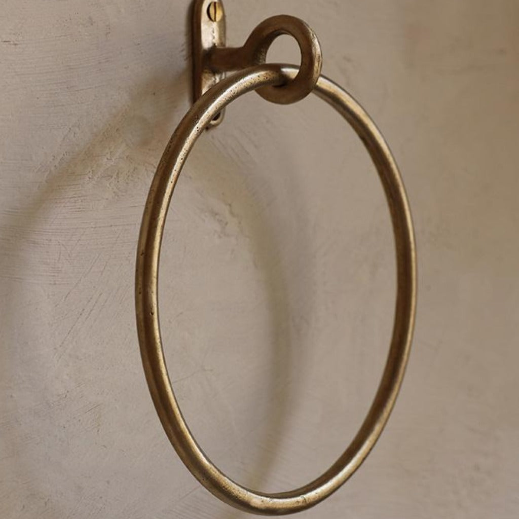

This is the premise behind everything Casson sells. Cabinet hardware, door hardware, shelving, hinges, electrical fittings, lighting, sanitary ware — the categories that traditional architectural specs treat as line items to clear off a list. We treat them as the part of a project where intention shows.

Details are not afterthoughts. They are the architecture of daily life — what we touch, grasp, and notice each day.

A curated, sustainable practice

Our collections are built around makers and manufacturers whose work we respect. Many are small studios — Maha Alavi, Chapman & Bose, mudd. concrete — producing hardware by hand, often to order, in deliberately small runs. Others are established names — d line, Bocci, Anony — whose engineering and finish work has set the standard for decades. Across both, the pieces share a sensibility: restrained, materially honest, made to last.

For commercial and hospitality projects, we carry marine- and commercial-grade hardware that performs in demanding environments without sacrificing the quality of finish. For residential work, electrical fittings, lighting, and sanitary fixtures complete a project the way they’re meant to — quietly, in keeping with everything around them.


Hand polishing a Mineral Metal Knob


Hand stitching leather cabinet pulls at Chapman & Bose
Hand polishing and stitching at Chapman & Bose.

The poetry of the everyday

Details matter because they are the points of contact. They are what the eye returns to and what the hand learns the shape of, repeatedly, over years. In their refinement, they add poetry to function and intention to form. To leave them unconsidered is to leave a space’s story unfinished.

That’s the principle behind every collection we carry. Browse the hardware, lighting, and electrical ranges, or get in touch about specifying for a project.